This is an archive of the writing and research surrounding the Colophon Cards project.
The initial work on Colophon Cards was funded by The Icelandic Centre for Research’s Technology Development Fund. I had originally hoped to get a grant to further develop the project from that fund, but that fell through. I’m still hoping to restart work on the project, but in the absence of funding the scope will inevitably be much more limited and is likely to look very different from the vision presented in this archive.
Design Notes
The high concept (in apps)
Colophon Cards should be the marriage of Notational Velocity’s search-first navigational model with Twitter’s card stack model.
Most people don’t notice this but Twitter’s conceptual model is that of a recursive stack of cards. Each tweet is about as much as you’d fit on one side of an index card. Each tweet is also a thread which is a stack of related cards. The timeline is a top-level thread/stack. This is the reason why the algorithmic timeline is such a disruption of how even non-techies use Twitter: it’s a fundamental break in the service’s basic design.
From Notational Velocity’s website:
The same area is used both for creating notes and searching. I.e., in the process of entering the title for a new note, related notes appear below, letting users file information there if they choose. Likewise, if a search reveals nothing, one need simply press return to create a note with the appropriate title.
If a note’s title starts with the search term(s), that title will be “auto-completed”. This selects the note and consequently displays it. Correspondingly, selecting a note places its title in the search area (De-selecting the note restores the search terms).
To create a new note, just type its title and press return. Edit the note as needed in the bottom pane.
To view or edit an existing note, type one or more words contained in its body or title. Reveal a note’s content by using the up/down arrow keys to select it.
My theory is that I can adapt this navigational model to work with the cards and stacks model popularized by Twitter.
Terminology
Threads: I’ve decided to prefer threads over stacks as, even though, they would mean the same thing when you are building with cards as a core metaphor, they’ve come to have specialised meanings in UX and UI in general. Namely, a thread has come to be the standard term for “a linear sequence of things, some of which may also be similar linear sequences of their own”.
Cards: this has also become a generic term for a UI widget that contains some form of content.
Activity/Activity Stream: often called event stream. This is a stream of the events/activities that form all of the data belonging to a particular user. This is usually an implementation detail (every social media platform implements something like this, as do most apps/services that need to sync data from one place to another). But I would like to test surfacing it as a UI element to see if it helps recall and aids understanding.
The main single-user loops
The thread
The core UI view of the app is a thread of cards (or cards and actions on cards, if I follow through with the activity streams idea).
The UI would be structured in a way that’s similar to Twitter or Mastodon:
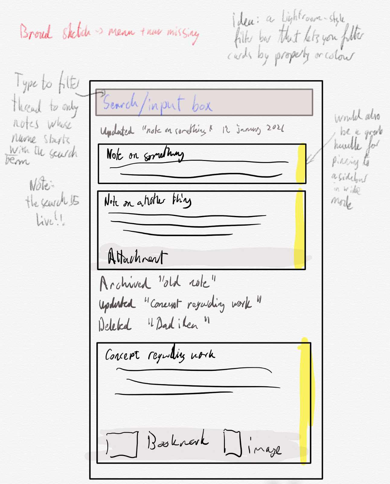
- At the top you have an input box.
- Below it you have a stream of cards and activities in reverse-chronological order (newest first).
- Type text in the search box
- The thread is then filtered to only shows cards whose name begins with the search text until there is one (to update) or none.
- At any point in the search, the user can hit the button or press return to create a card with that name. Or they can edit the top card and autocomplete the term to that card’s name.
One of the core properties of a search-first UI like this (true search first, not baked-on-because-we-don’t-do-design search first like Google Drive) is that it makes you much more aware of the names of things and constantly surfaces older, relevant, cards as you are thinking about names for your new thing.
The innovation here over Notational Velocity is that each card is also a thread and therefore a completely encapsulated search space. So, you can have a thread for ebooks. A thread for images. A thread for a project. For bookmarks.
Thoughts:
- I am tempted to have the thread be an activity stream. Instead of just the cards, you would also have the activities on those cards listed in the thread. Like “You updated ‘design notes’” or “You archived ‘design notes’”. I would like to see if having explicit records on your activities in a thread is a helpful mnemonic or not. AFAIK there hasn’t been much research on whether this is helpful in a single-user context so I’m tempted to test it out.
- Full-text search would be on the roadmap but I need to demonstrate the practicality of the basic design model first.
- The user shouldn’t be able to create multiple cards with the same name in the same thread. Trying to create a card with a name identical to another would bring up an edit view for that card.
The Card
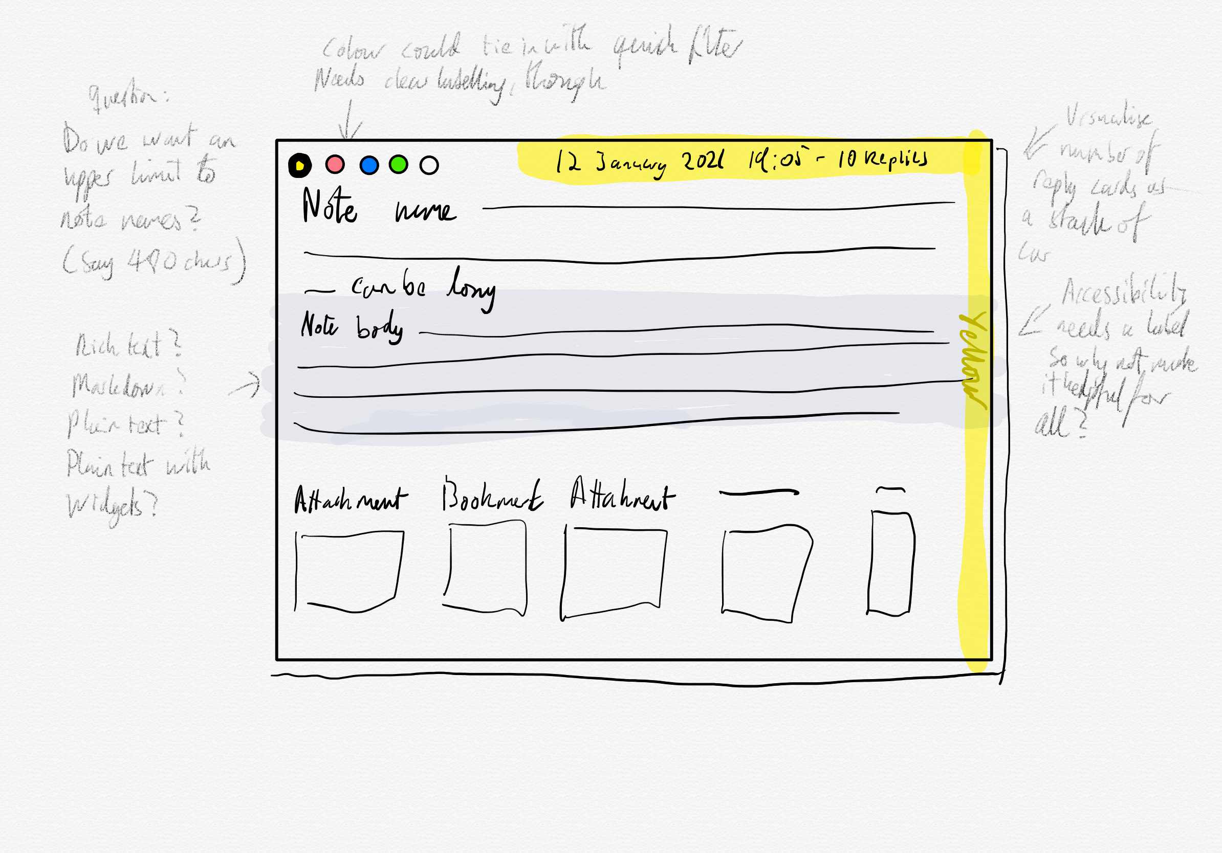
The created card has a name, replies (only displayed when you open the card as a thread), attachments, and a body. Possibly later a drag handle.
Thoughts:
- “name” might be the wrong term for what is, in effect, the main text of the card and should be thought of as more akin to a tweet than document title. Maybe ‘card text’ (plain text, quick search) versus ‘card body’ (rich text, only findable using a full-text-search feature down the line).
- Should the body be rich text, plain text or markdown (irrespective of what it’s stored as)? Markdown is the de facto note standard but is honestly a mess of partially compatible implementations. It also forces a modality to your editing: notes have two completely different modes that look and work in very different ways. Plain text is universal but incredibly limited. A rich text interface has the most potential but is more complicated and harder to pull off.
- More on modality: getting rid of modes does more to make a UI feel fast than most of the performance work engineers love to throw at problems like these. The “find item -> click edit on item -> edit -> save item” cycle is always going to feel slow, no matter how many optimisations through throw at it. If you figure out a way to make it “find item -> edit item” (no ‘edit mode’) then the UI will feel fast no matter how unoptimised the implementation is.
Tags
Add tag support by assigning all tags mentioned in the body or name to the card. You can show all cards with that tag by entering it (with the preceding #) in the search box.
Replies
Every card is also a thread. The replies link on the card is a link to the card’s thread. The card thread UI is identical to the top thread UI. Replies are created in the same way with the same loop as in the top thread.
Thoughts
- I would like to avoid having a specific reply UI and instead keep the conceptual model the same all the way down.
Workspaces/Accounts?
Should the user be able to have multiple top-level threads, each a separate workspace? Or do the child cards of a solo top thread serve the same function?
Pinning
The UI should support pinned notes that are persistently floated to the top. One idea is that on displays that are wide enough the pinboard should be a sidebar space and that pinned cards don’t have to just be pinned up to but that they could be arranged freely in the sidebar space.
Bookmarks
Much like Twitter or Facebook, the URLs mentioned in the name or the body are automatically added as attachments.
Attachments
File attachments are added via an attach button.
Thought:
- I could implement a website archiving system that archives a bookmark URL if you add the URL via the attachment UI instead of directly as text?
Quoted Cards
A special kind of attachment is the quoted card (a concept stolen from Twitter). This is a mechanism for bringing a card from one thread in as a reply to another. Cards shared from other users would also be read-only quoted cards in your threads.
Cross-linking
If I go with markdown or plaintext [[Note Name]] would be used to automatically link to the note.
If I go with rich text I would probably try to implement it using a +Name mentioning system similar to Slack’s @ mentioning system that autocompletes including the spaces.
Or, I could go with the original WikiWiki design and convert all camel-cased words to links to other notes?
Links to nonexistent notes let you create that note by clicking on them.
Backlinks
Automatic backlinks are not a good idea. They create clutter, complexity and confusion. See Backlinking Is Not Very Useful – Often Even Harmful. Intentional backlinks, however, are amazing. The ability to explicitly add a backlink from another note to the current note you’re editing, preferably with custom link text for that context, is an extremely useful organisational tool.
How to design it, though, is a question, and it depends on the text format and link format.
Sharing
Designing the sharing and collaboration mode should be a separate document. But the threads and cards UI should be single user. Nothing should happen in your threads or to your cards that isn’t done by you. Sharing should be about data, attachments and sharing your threads (or subsets of your threads) with others as documents.