This is an archive of the writing and research surrounding the Colophon Cards project.
The initial work on Colophon Cards was funded by The Icelandic Centre for Research’s Technology Development Fund. I had originally hoped to get a grant to further develop the project from that fund, but that fell through. I’m still hoping to restart work on the project, but in the absence of funding the scope will inevitably be much more limited and is likely to look very different from the vision presented in this archive.
Working Spaces: Using Cards to Make Cards
The problem space
One facet of my undiagnosed but almost certain neurodivergence is that, when it comes to work, out of sight is very much out of mind. I like big desks with notes, sketch pads, dot grid pads, post-its, and other scraps of paper spread out all over. Pads with notes to extend my working memory. Pads with sketches for whatever it is I’m working on. Diagrams for interaction models or class hierarchies. Database modelling. Ideas. It’s spread out, displayed, taped to walls, and then discarded upon irrelevance. I like whiteboards or chalkboards and big spaces to tape things on.
Even when I have been working in shared spaces, like an office, I’ve always had to do a little bit of the work at home, where I usually have had a wall set aside for notes and sketches that are taped to it and spread out so I can see them all at once.
For me, space = thought. Which is where index cards come in.
I like index cards. A stack of index cards and a big, big table is great when you want to figure out:
- The individual components of a system
- How they relate to each other
- How they should relate to each other
- And which points in the system are touch points where you can act on it.
This is great for writing (where “system” = “narrative structure”) and for software (where “system” = “design”).
I prefer index cards for this over post-its as index cards are less fiddly and less disposable. With index cards, the exact spatial relationship isn’t that important (the stickiness of a post-it gives position a unwarranted heightened importance). It’s more about rough distances and piles and those can be documented on a separate card or by marking the cards themselves. You can also always put post-its on an index card to the two tools are somewhat complementary.
That way the index cards can be filed away and revisited. The work continues.
Using index cards for this also lets you pull in your index card notes such as your reference or idea cards.
Which is why I still prefer index cards over post-its even when I only have a wall available and not a table. Just use easy-to-remove paper tape and spread them on the wall.
If you haven’t guessed by now, I loved the original, classic-era Mac, spatial/object-oriented Finder. It was a rare case where the conceptual design and affordances of an app fit my mentality, personality, and way of working perfectly. (Or as perfectly as software can get.) But the software world moved on and we need to adapt with the times.
Here’s one of the main gambles with Colophon Cards: if I design a note-taking app that suits my own neurodivergence, will I be relegating the app to a tiny minority who, quite literally, think differently from the rest?
Or, as is often the case with making software and services more accessible, will making it usable for people like myself expand the capabilities of those unlike myself and make the app more adaptable to varying needs?
Too early to tell but you can tell which I’m betting on from the fact that I haven’t given up yet.
This means that there are some basic capabilities that the default view of a collection of cards needs to have:
- Some kind of spatial positioning.
- It has to be mostly automatic for new cards as nobody wants to position every note by hand.
- It has to let you not care about space when it doesn’t matter.
- It needs to work with the card metaphor that is Colophon Cards’s raison d’être.
Tinderbox is the only app that offers broadly the capabilities that I’m aiming for but it also offers much, much more, in a package that has a steep learning curve. I’m also hoping to make Colophon Cards more bookmark-, document-, and reading-oriented. But Tinderbox is a great app, you should check it out. I used it quite a bit back in the day myself.
The open questions are:
- Do we need to enable multiple representations/views of the same structures?
- Can we even have multiple representations without breaking the user’s conceptual model of the work?
- Do we need to worry about striking a balance between positioning and automatic layout?
- What approaches or metaphors lend themselves to the style of working I’m hoping to support?
The approaches
In existing note-taking apps, multiple views of the same note collections happen broadly in one of three ways:
- Main + Visualisations. One primary view and a number of informational secondary views that are essentially read-only infographics. E.g. a note-taking app with a graph view of the note relationships.
- Main + Output. One primary view and a number of different outputs. E.g. a note-taking app where you can import notes into an outline or document but the actions you take in those views don’t translate back into the main view.
- Main + Different Representations. Finally, you have apps where each view is just a different representation of the same structure. E.g. if you move a note descendent to a different parent note in the outliner view, that change is represented in the map or block views as well.
- All of the above. You could also risk confusion and simply use all of these approaches in a single app.
Each approach has its uses, strengths and weaknesses. Supplementing a complex, power user main view with helpful visualisations can work well. Implementing different views as essentially their own documents can help you support a wide variety of use cases in a single design—provided you have the resources to implement a de facto app ecosystem wrapped up in a single environment. Finally, multiple representations of the same data works well if the views broadly share affordances while offering distinct visualisations and navigations of the same data. For example in the macOS Finder, how you interact with the files and folders is quite similar across representations but it lets you represent a folder of images with big icons, a deep hierarchy of documents with a column view, and a large directory of downloads as a reverse-chronological list with details.
If you can’t tell, I’m still a huge fan of macOS’s Finder, even though it’s evolved a bit from my ideal.
The downside of the representational approach is that it’s easy for the app to devolve into a cluster of complex apps that share little.
The upside is that if you pick the right representations, the ability to switch views can strengthen the user’s conceptual model: shared affordances get reinforced.
So…
What the cards tell you, take one
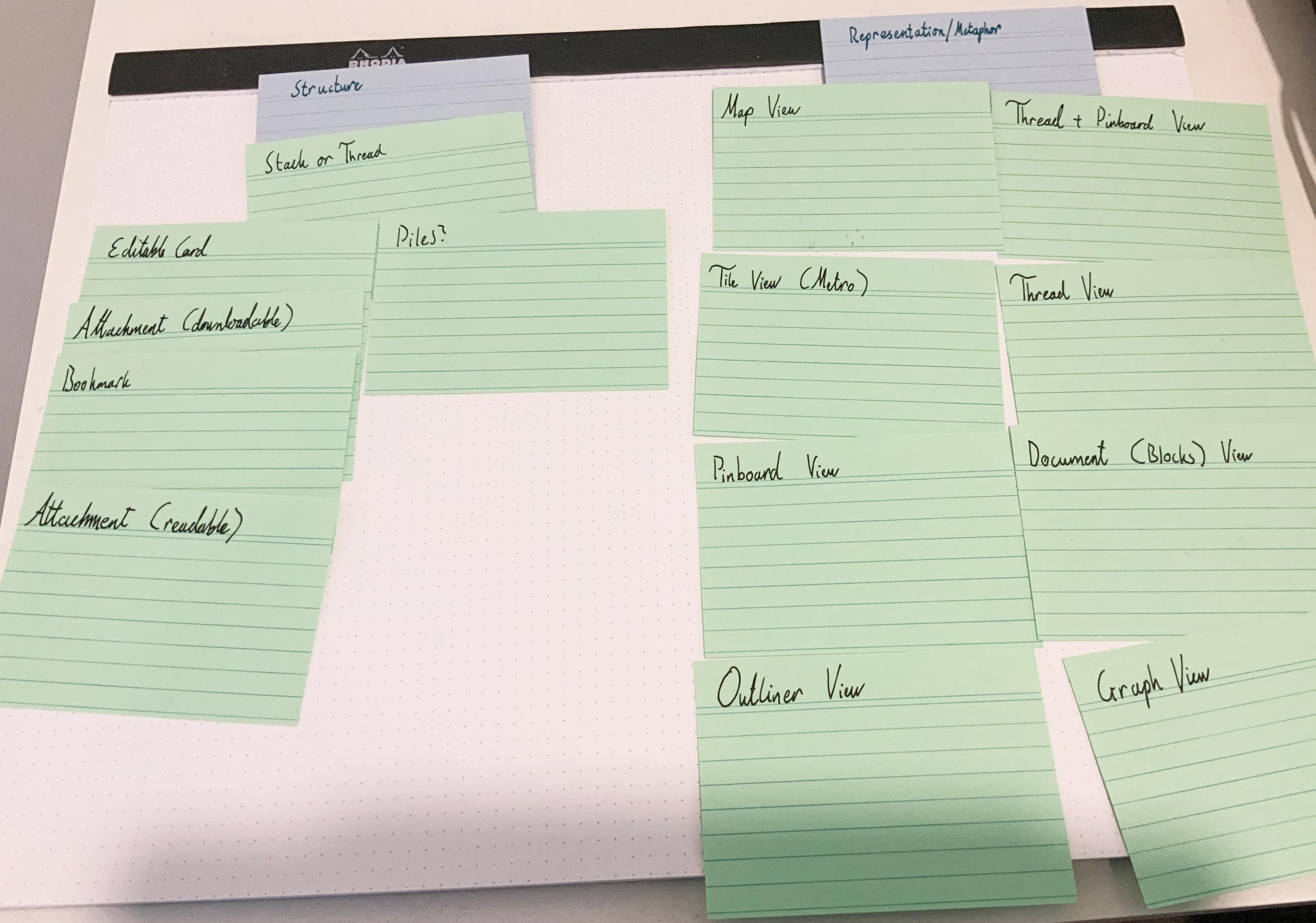
A few notes on this initial set of cards:
- Stack versus threads is a question of structure versus representation. The stack is the structure. Thread is one representation.
- Graph view is what Tinderbox calls a map view: a 2D space where the relationship between cards is represented with lines.
- Map view is anything with an X and Y axis where distance is meaningful. Timeline would be a subset of a map view.
- The thread view is more generically a list view, even though in this context we’d use thread-like styling.
- The only difference between the Pinboard view and the Threads + Pinboard view is where unpositioned cards are automatically placed: in rows, or in a column on the left.
- Tile view is the general approach used in the iterations of Windows that was initially labeled ‘Metro’. Tiles of varying sizes are laid out by the system. You can tell it which tiles should be bigger and which smaller. Pinterest’s layout is a similar concept.
- This is missing a spreadsheet card and timeline card, for completeness sake, even though I’m not planning on either.
- Piles[PDF] is the design concept that Apple developed but never shipped. It’s stuck in my brain and has been for several years.
- Reading- and annotation-related cards are missing from this. Not sure how they fit in there.
What the cards tell you, take two
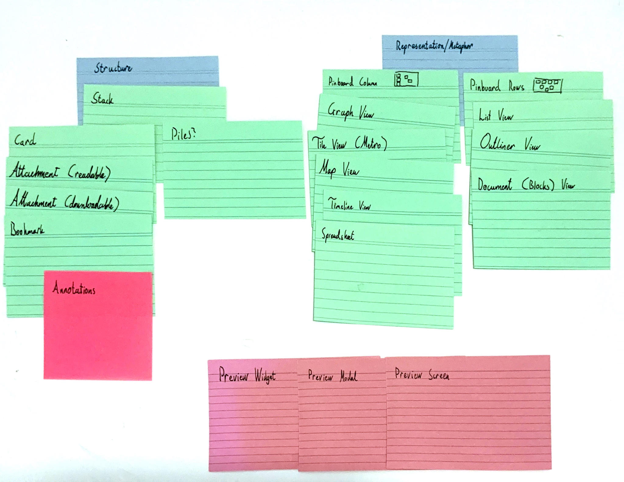
- I added annotations as a post-it on one of the cards because I think that’s funny. No other reason.
- Pinboard and Threads + Pinboard is now Pinboard Rows and Pinboard Column with a little explanatory icon.
- Thread view is now List view.
- I added Timeline and Spreadsheet views.
- Attachment preview possibilities are laid out as three pink cards to the bottom. Widget, Modal and Screen.
- Widget: the preview of the attachment is rendered as a widget in the stack representation. Something along the lines of the preview column in Finder’s column view. This isn’t done enough in modern web apps where the popularity of modals has rolled back 30 years of progress in multitasking productivity.
- Modal: What everybody does. Click an attachment; it gets displayed as a modal, blocking you from interacting with the workspace.
- Screen: a dedicated full view. Interacting with an attachment takes you out of the stack representation and into a dedicated view for interacting with the attachment.
- I also rearranged the cards to better reflect how they are related.
That’s a lot of options; a lot of potential representations of a single stack. Let’s see if I can’t whittle it down.
Cutting the deck
First, let’s sort them in order of priority.
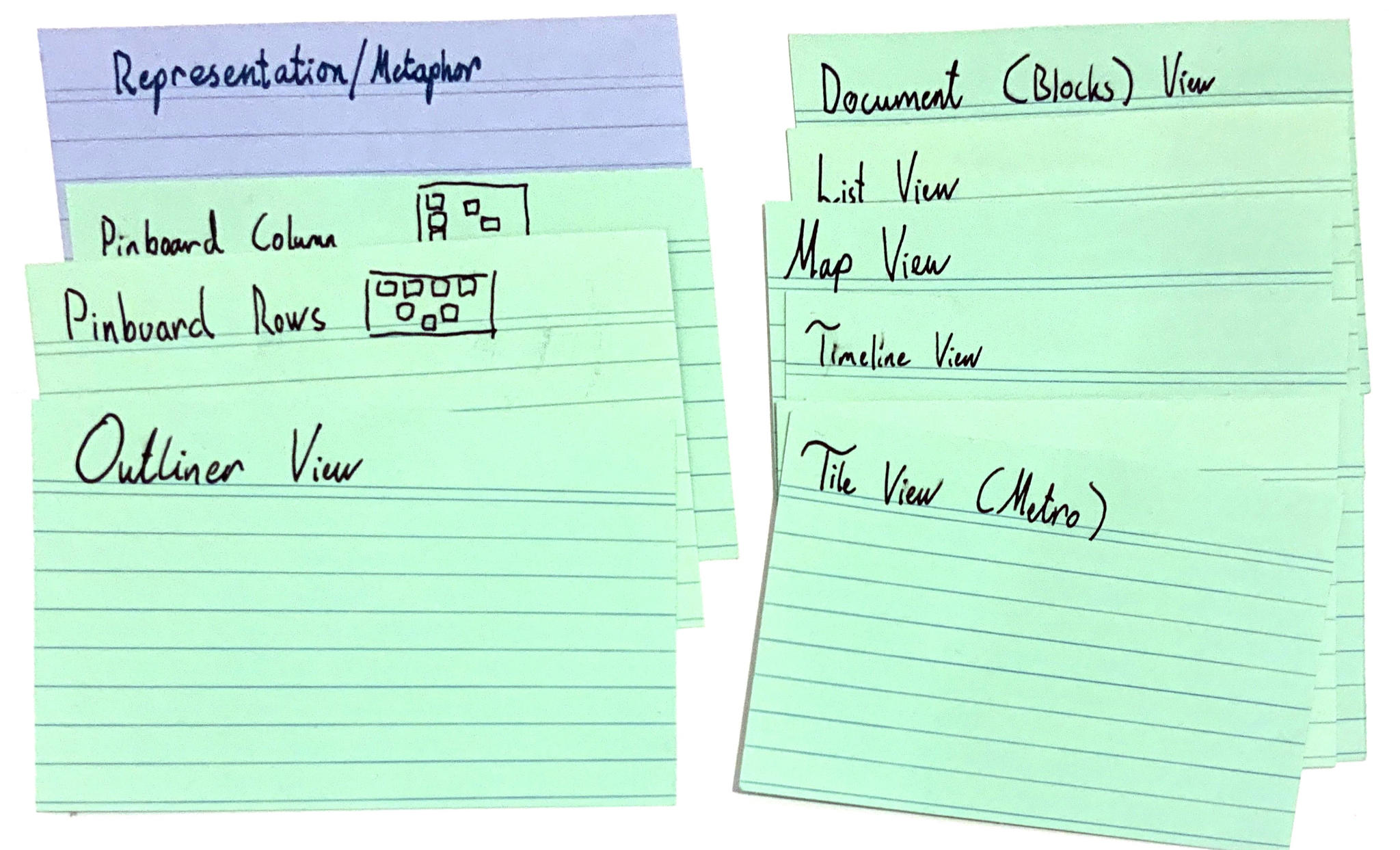
- The Pinboard Column strikes me as a sensible default. Unpositioned cards run along one of the right- or left-hand edges of the screen and the rest provides ample space for positioning. It also scales relatively well down to mobile, although you would need some sort of indicator, icon, or something to show that there is something off-screen to scroll to. This view shouldn’t wrap as it needs to serve the role of a default list view as well.
- Pinboard Rows are also important as they are useful for displaying cards in a grid. (Question: rename to Pinboard Grid?) A grid view, especially if zoom works, can serve as a bird’s eye view of a stack.
- Finally, the Outliner view emphasises fast navigation into hierarchies and complements the other two nicely.
The rest are all candidates for future work but well beyond the scope of the initial version. Even the Outliner View is probably not going to be in scope for the initial prototype.
Implementation notes for future reference
- Position data should be persistent but unique to the view. Pinboard Column and Grid (hmmm? kinda works) shouldn’t share position data but they should share hierarchical structure.
- Being able to demote cards in place so that they are hidden from this view but easily promoted again from the same context is quite important.
- Getting drag and drop and making drag and drop usable via keyboard is essential.
- The views need to support exactly the kind of work that I’ve been documenting in this post in addition to the primary task of managing reading, documents, and notes related to those two.
- The primary competition here aren’t other apps but cheap index cards and a pencil.
The next step is to sketch up these three main views and figure out a testing strategy. For the sketching, I might have to break each view down into individual cards as I did here. (Hierarchy!)